
Farmers MarketsGuide
Booth Merchandising: How to Design a Farmers Market Display That Actually Sells
Retail display rules were written for stores with shelves and overhead lights. Here is how they translate to a 10-by-10 canopy: height and tiers, the front edge, color, abundance, sightlines from across the aisle, coverings, and a clear place to pay, plus an exercise for seeing your booth the way a stranger does.
 United Farmers Market Editorial Team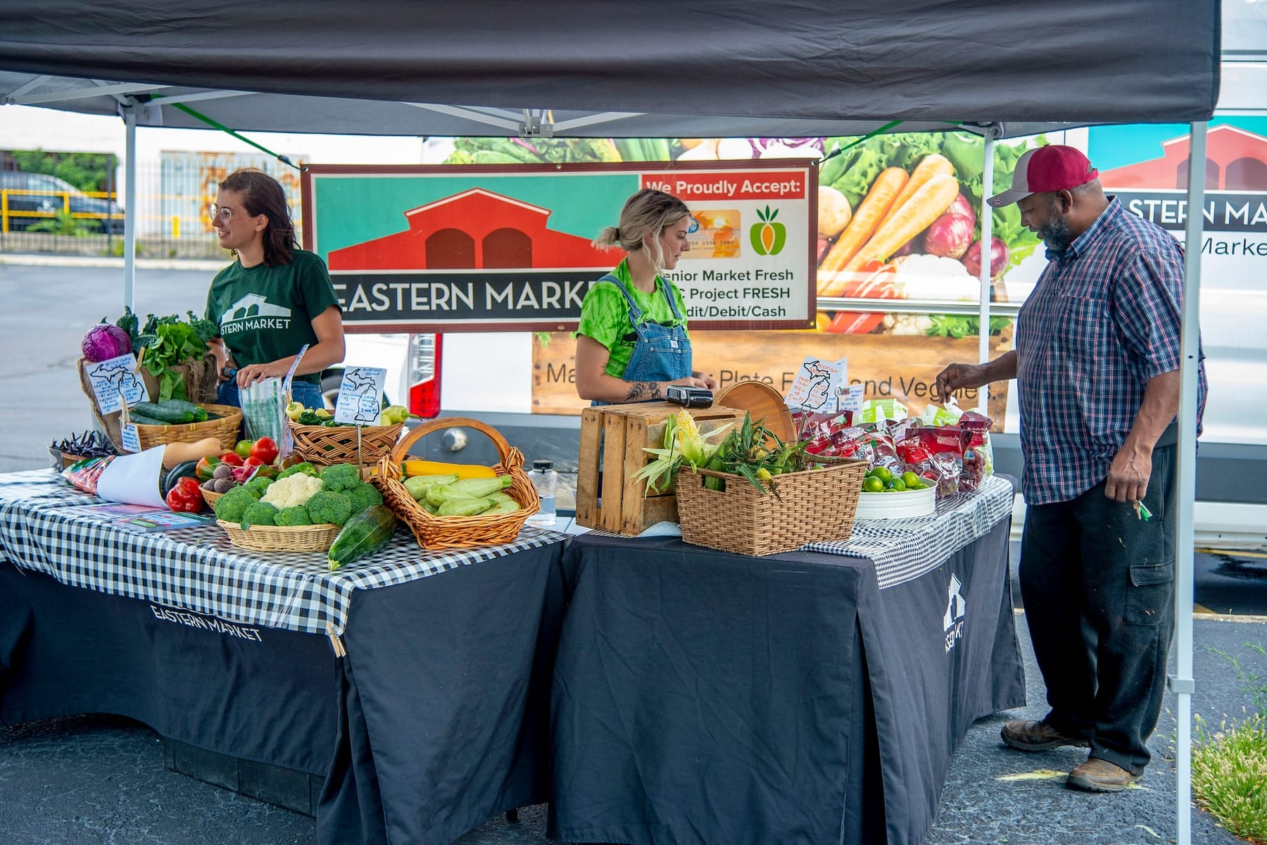
In this guide
Stand at the end of a market aisle on a busy Saturday and watch what shoppers do. They drift down the middle, eyes moving left and right, and they slow at some booths and not others. The ones they slow for are not always the ones with the best product. They are the ones that read clearly from across the aisle: something tall, something colorful, and a name they can make out.
The University of Tennessee's merchandising bulletin for direct farm marketers, PB1794, puts the window for a first impression at about three seconds, and at a market that impression forms in the aisle. Retail stores solve this with fixtures and floor plans; you have a folding table and about thirty minutes. This guide takes the principles from university extension merchandising bulletins and adapts them to a 10-by-10 space, organized by distance: across the aisle, at arm's length, and at the moment of payment. Where the advice is editorial rather than sourced, we say so.
From 20 feet: shape, height, and the banner
From across the aisle a shopper sees shape and color, not price cards. A flat table with product laid out in one plane presents almost no shape; it reads as a tablecloth with some things on it.
Build height. Tennessee's bulletin and the University of Wisconsin-Extension's Creating a Winning Display for Your Farm Products agree on the numbers: most shoppers stand between about 5 feet 4 inches and 6 feet 2 inches, product below knee level or above eye level is less likely to sell, and a selling surface should be 36 to 40 inches high. Choose a stable, height-adjustable table that reaches the recommended selling height, and check its load rating and locking mechanism. On a fixed-height table, build up the display with stable crates, tiered stands, and inverted boxes under the cloth, keeping heavy items low. Vermont Extension's display bulletin suggests filling deep baskets partway with straw so a basket looks full with less product in it.
Two or three levels is enough: a low tier at the front edge, a middle tier at table height, and a back tier that brings your best-looking product near eye level. Tennessee cites a 15-degree slope toward the customer as the industry standard for shelves, and both bulletins cap display depth at about 2 feet, which is what a customer can reach without leaning.
Nothing on the ground. Tennessee is blunt: customers associate the ground with dirt and do not want to stoop. Wisconsin's exceptions are pumpkins, which sit at the right height for the kids who want them, and bedding plants. For everything else, knee height is the floor.
Hang the name high. Tennessee calls a name sign across the front of the table ineffective because the moment two people stand at your table, it disappears behind them. Put the name above head height, on the canopy's front bar or a banner across the back. The Washington State University vendor booth guide, Sell More!, gives the banner rule as: the fewer words, the more likely anyone reads them. Name, town or region, and a logo or one strong image. The product list goes on a smaller sign at the table.
From five feet: color, abundance, and the front edge
Once a shopper has slowed and taken two steps toward you, they are reading whether the booth looks cared for and whether there is plenty.
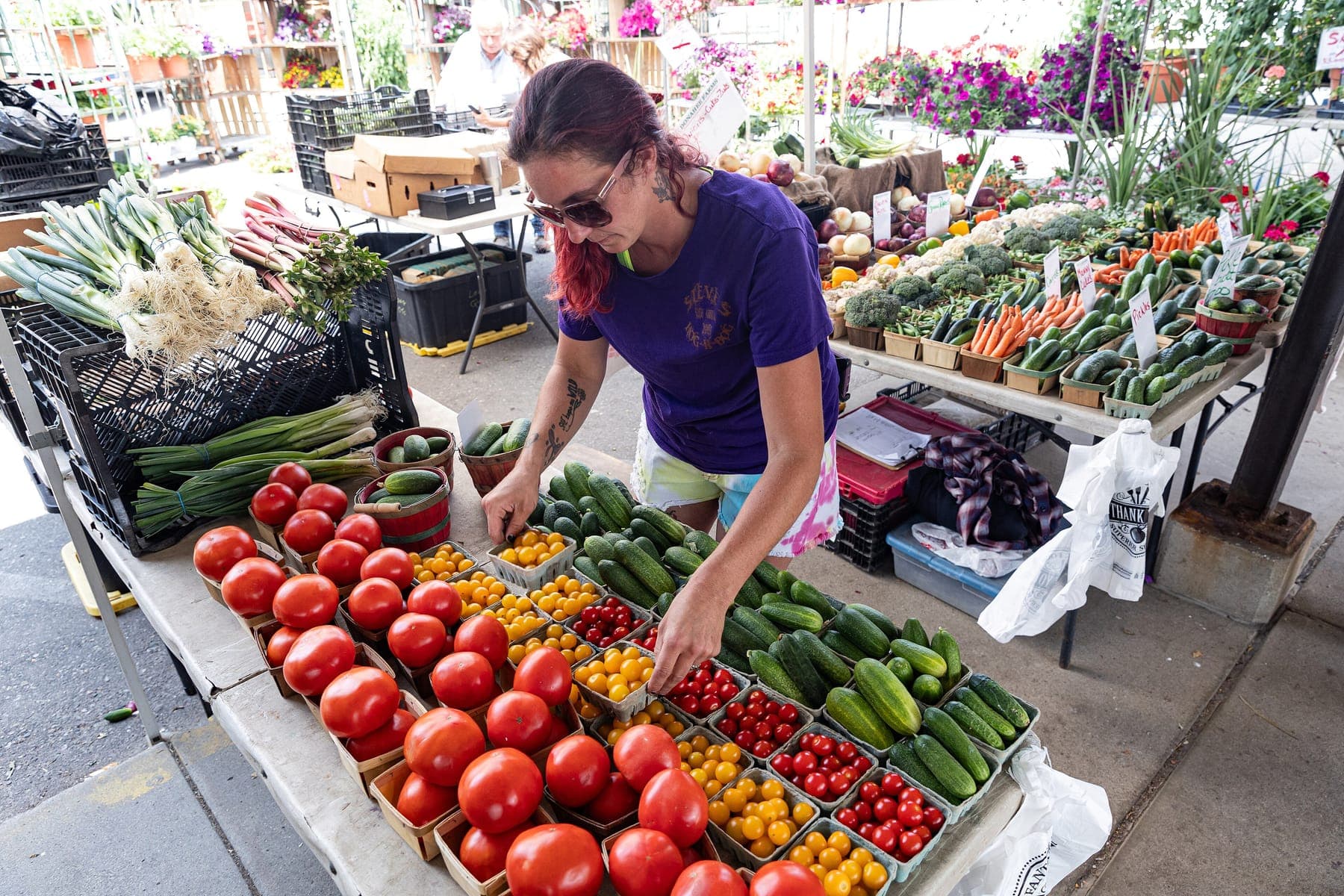
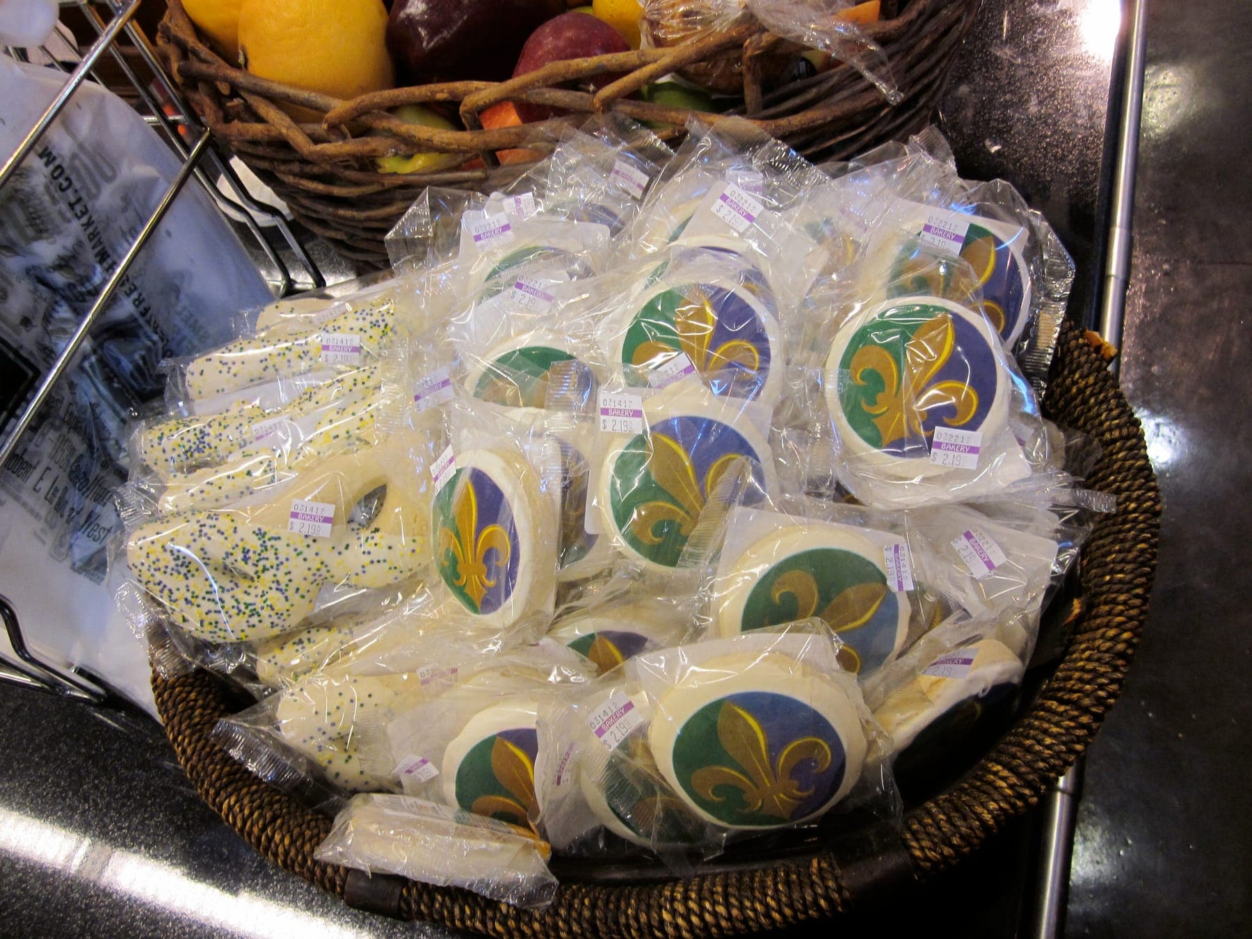
Block and alternate color. Tennessee recommends arranging product so contrasting colors sit side by side: green next to red next to yellow. Bakers have less raw color than a produce farmer, which is why packaging matters so much on a cottage food table. A run of identical kraft bags is a brown rectangle from 20 feet; the same bags with a strong label color, or broken up by a basket of something golden, is a display. Our packaging guide covers the materials side.
Look abundant, not picked over. Tennessee's bulletin quotes the old retailing adage "pile them high and watch them fly" and explains why it holds: a display with a few items on it looks picked over, and shoppers assume what is left is what nobody wanted. The fix is consolidation, not more inventory. As product sells, move what remains into smaller containers so each stays full, and pull empty baskets. Vermont adds that late shoppers who see a sparse table assume the best of it sold hours ago, so keep restocking for the whole selling period. Scarcity has a narrow place, and this part is our own observation rather than the bulletins': a hand-lettered "3 left" card can still move the last three of something, but only while the rest of the table looks full.
Fill the front edge. The bulletins do not name this one, so treat it as editorial guidance. Vendors set up from the back forward, run out of product or energy, and leave a bare strip of cloth along the front. From the aisle that strip reads as empty space between the shopper and the goods. Tennessee does say to push product to the front for easy access; we would call the front 6 inches the most valuable real estate you have. Put your entry-price item there and keep it full until you pack up.
Freshness is part of the display. Wisconsin's bulletin gives two numbers worth remembering on a hot day: strawberries lose moisture roughly 10 times faster at 70°F than at 33°F, and sweet corn displayed at 70°F loses about half its sugar in a day. A display that looks lovely from the aisle and wilted at arm's length fails where the sale happens. Shade the perishable tier and keep backstock in coolers, rotating it forward as the display sells down.
At the table: grouping, reach, and where the price goes
At arm's length the shopper is deciding what to pick up. Two things make that easy.
Group by how people shop. Wisconsin describes displays built around power items (the product that draws people in, like strawberries in season) and impulse items (the thing they did not plan on, like honey or a gift pack). Put the power item where the aisle can see it and the impulse items near where money changes hands. Within the table, group things that go together: bread beside jam, the salsa kit beside the tomatoes.
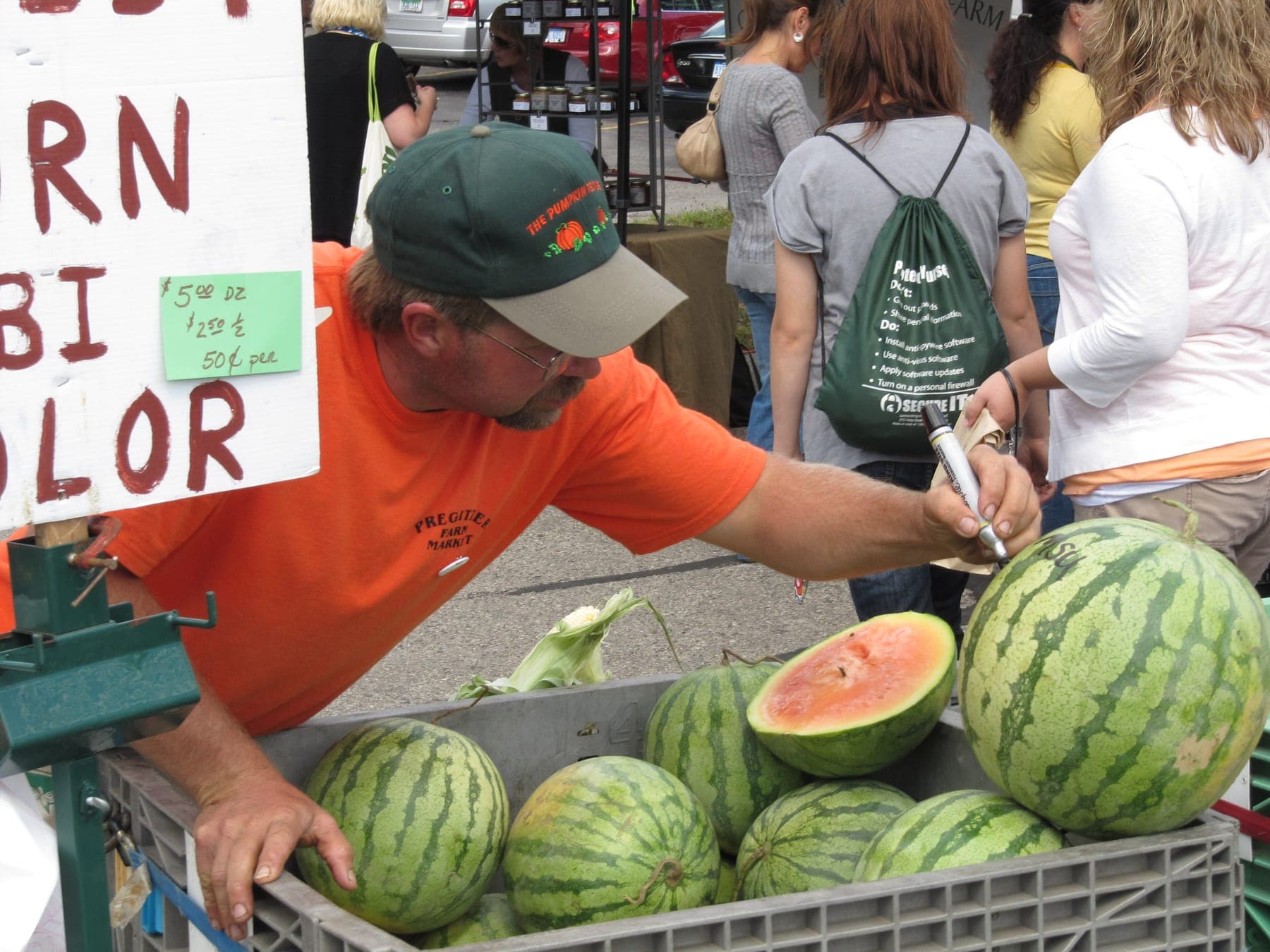
Price at the item. Tennessee and Vermont make the same observation: customers do not want to ask what something costs, and many walk away rather than ask. So the price goes where the item is, on a card in the basket or a tag on the jar, not on one chalkboard behind you. Vermont's rule of thumb is that a price sign should be legible from 3 to 5 feet. Tennessee recommends dark letters on a light background, a plain font, and capitalizing each word rather than writing in all caps; the WSU guide lists black on white, yellow on black, and white on blue as the easiest combinations to read. Our companion piece on signage and price cards covers materials, sizes, and wording, including keeping regulated terms like "organic" off your signs unless you are certified.
Coverings and light under a canopy
Cloth to the ground, in one color. Tennessee recommends a solid, unpatterned covering in a color that complements the product, on the principle that the cloth should accentuate what sits on it rather than dominate the display. That is the case against the checked picnic cloth so many vendors default to (Tennessee does not single it out; we do). Green under red tomatoes; blue under orange pumpkins; burlap if it fits the farm. Vermont's version is natural earth tones for food and no loud prints. Whatever the color, run it to the ground on the customer side, so the boxes, coolers, and culls underneath stay hidden.
The canopy is your lighting. Under a 10-by-10, the canopy top is the light source, and its color tints everything under it. Tennessee recommends a white, tan, or beige canopy because it shows product in natural light; light filtered through a brightly colored top can make food look unappealing. The blue canopy that seemed like good branding is a color cast on your bread. For evening markets, battery LED strips or clip lamps on the frame, aimed at the product rather than the customer's eyes, are the usual answer (editorial guidance; confirm your market allows lights).
Weight the legs first. A canopy that goes airborne takes your display with it. The Washington State Farmers Market Association's canopy safety guidance for its member markets sets a minimum of 24 pounds per leg and 50 pounds for an umbrella, and notes that one canopy manufacturer recommends 40 pounds per corner on a 10-by-10. A gallon jug of water weighs about 8 pounds and does not count. Markets elsewhere set their own numbers and can send you home for arriving without weights, so read your vendor handbook. Weights belong on the ground, strapped to the leg, with no cords across the walkway.
Keep a clear transaction zone
A booth can look wonderful and still lose sales at the register, because paying customers and browsing customers are trying to use the same 3 feet of table.
Vermont's bulletin says to place the register so people waiting to pay are not blocking new customers from getting in. The WSU guide puts it as a design principle: bags, scale, and cash box placed strategically direct movement. In practice, one end of the table, the downstream end in the direction most traffic flows, is the pay point, and it stays clear of product. Card reader, cash box or apron, bags, scale, and a small sign listing the payment types you take live there. Nothing else does.
Vermont recommends a linear setup, tables across the front, for a narrow space, because it gives the most display for the width and keeps the back clear for restocking. With a U-shape, tables down the sides as well, Vermont notes that many vendors find a cash apron easier than a register. Whatever the layout, keep hands empty. Tennessee and Vermont both make the point that a customer holding things has stopped shopping, so offer a bag the moment someone picks up a second item.
Walk your booth as a stranger
This is the most useful thing you can do with ten minutes before the market opens. The WSU guide, citing a Growing for Market feature, calls it walking 10 feet in your customers' shoes. We push it out to 20, closer to the far side of a typical aisle.
- Finish setting up completely. Signs out, prices on, cloth straight, register stocked.
- Walk 20 feet down the aisle in the direction most shoppers will come from. Turn around.
- Answer honestly: Can I read the name? Can I tell what is being sold? Is anything tall enough to catch the eye? Does it look full?
- Walk to 5 feet. Can I tell what things cost without asking? Is the front edge full? Is anything on the ground?
- Step to the table. Reach for the thing at the back and the thing in the corner. Find where I would pay. Is that spot clear?
- Look under the table. If you can see boxes or a trash bag, so can everyone.
- Fix the worst thing you found. Do it again next week.
When you land on a setup that works, do what Vermont recommends: photograph it from the aisle, sketch the layout, and keep both in a folder so a helper can reproduce the booth without you. Our phone photography guide is aimed at product shots, but its advice on light applies to a booth photo too.
Before and after
These are the changes that come up again and again when a booth goes from ignored to busy. None require new inventory.
| Before | After |
|---|---|
| Product laid flat on a 29-inch folding table | Two or three tiers, top tier near eye level, table raised toward 36 to 40 inches |
| Business name on a sign across the table front | Name on a banner above head height, in the fewest possible words |
| Patterned cloth that stops at the table edge | Solid cloth in a complementary color, skirted to the ground |
| Bare strip along the front of the table | Front edge full of the entry-price item, kept full all day |
| One chalkboard of prices behind the vendor | A price on or beside every item, legible from 3 to 5 feet |
| Card reader and bags wherever there was room | A fixed pay point at one end, with nothing else on it |
| Colored canopy, no weights | White or tan canopy, weighted to the market's minimum before the first box comes out |
What to do before your next market
Pick one section and fix that. Height first, if your table is still flat, because it is the change shoppers notice from farthest away. Then the front edge and prices, where slowed-down shoppers become buyers. Our booth setup on a budget piece covers doing this without a big spend.
If you have not applied to a market yet, start with how to become a farmers market vendor, then come back once you know which way the aisle runs. Tennessee's bulletin ends on customer service, with a plain list of what puts shoppers off: looking indifferent, eating, taking personal calls, sitting down. The person behind the table is the largest part of the display, and no amount of tiering makes up for a vendor on a stool looking at a phone.
Sources and further reading
- 1.Making the Most of the Market: Merchandising Considerations for Direct Farm Marketers (PB1794) · University of Tennessee Extension, Center for Profitable Agriculture · accessed Sep 2, 2026 · Three-second impression; shopper heights 5'4" to 6'2"; tables 36 to 40 inches, 2 feet deep; 15-degree slope; nothing on the ground; pile high, consolidate; contrasting colors; solid cloth; name sign above head level; white, tan, or beige tent; hands empty; sitting or phone calls put customers off
- 2.The Art & Science of Farmers' Market Display · University of Vermont Extension · accessed Sep 2, 2026 · Abundance and partially filled baskets; customers reach 2 to 3 feet; signs readable from 3 to 5 feet; register placement; linear versus U-shaped layouts; cash apron; earth tones over loud prints; grab-and-go section; photograph and sketch a layout that works
- 3.Creating a Winning Display for Your Farm Products (A3811-2) · University of Wisconsin-Extension · accessed Sep 2, 2026 · Knee-to-eye viewing zone; 36 to 40 inch tables; shelves no deeper than 2 feet; pumpkins as the ground-level exception; strawberry moisture loss about 10 times faster at 70°F than at 33°F; sweet corn loses about half its sugar in a day at 70°F; power and impulse items
- 4.Sell More! Farmers Market Vendor Booth Guide (2014, Version 1.0) · Washington State University Small Farms Program, hosted by the Farmers Market Coalition · accessed Sep 2, 2026 · Market-day booth checklists; banner rules (fewest words, biggest name); easiest-to-read lettering combinations; place bags, scale, and cash box to direct movement; 'walk 10 feet in your customers' shoes' credited to Growing for Market; WSU Small Farms Program
- 5.Canopy Safety 101: Your Guide to Canopy Safety at WSFMA Farmers Markets · Washington State Farmers Market Association · accessed Sep 2, 2026 · Member-market minimum of 24 pounds per canopy leg and 50 pounds for umbrellas; one manufacturer recommends 40 pounds per corner on a 10x10; a gallon of water weighs about 8 pounds; weights on the ground and tethered; updated October 2012
Weekly newsletter
Market Dispatch
One email a week with the newest guide, what's in season, and a few things worth knowing before market day.
Email subscriptions are not open yet. Read every new story through our free RSS feed.
Follow Market Dispatch via RSS →Keep reading
Signage and Price Cards: The Small Details That Move Product at a Market Table
A shopper who cannot find a price often walks instead of asking. What the three signs every booth needs should say, how big the letters have to be, what survives weather, and the point-of-sale placards some states require by law.
· 7 min read
How to Become a Farmers Market Vendor: The Complete First-Season Guide
How markets are organized and why it changes what they ask of you, how to read a rulebook before you apply, what fees, insurance, and sales tax involve, what to bring, how the first morning runs, and how to judge the numbers after a month.
· 14 min read
Packaging for Cottage Food: Materials, Costs, and Presentation That Protects the Product
A bag or box has three jobs: keep the product safe and fresh, carry the label your state requires, and sell it from three feet away. Here is how to choose packaging by product type, what a unit really costs, and which states require sealed, labeled packages before you can sell.
· 12 min read

Product Photography With a Phone: A Practical Guide for Food Makers
Window light, a clean background, the right angle for each product, and ten seconds of phone settings matter more than any gear. Here is the routine, plus a shot list you can reuse every time you add a product.
· 8 min read